

If you feel that a room in your home is not working for some reason, take a picture of it! The resulting image will give you more clues about what is needed than when you are right inside the space. Why? Because you will look at the photo with more objective eyes.
The reverse is also true of course. Tons can be learned about design simply by studying great spaces.
Here are two of my favourite interiors from the on-line design inspiration Houzz. I can look at them over and over, taking in all the smart design choices that make them stand out.
Read on for more on what makes these rooms sing!
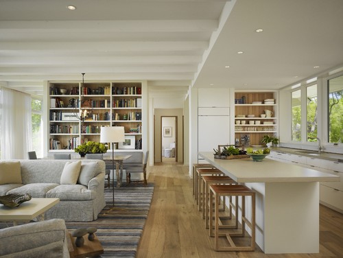 |
This open concept space has good architectural bones, with big
windows, varying ceiling heights, and pleasing interior views. Materials and colours are repeated throughout, pulling the space together and making it cohesive. The furniture is arranged in such a way that it defines different activities, while the oversized rug acts as a unifying element. It looks so obvious and and natural, but it didn't happen by chance! Photo: Houzz. Modern Living Room by Winnetka Architects & Designers Robbins Architecture. |
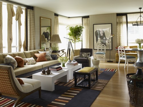 |
There is lots to look at in this eclectic living room by Thom Filicia! There is a nice mix of curved shapes - the ovals in the dining chairs, the soft arch of the closest armchair - and more rigid lines, such as the square tables and stripes in the rug. The colour combination is interesting, with the complementary colours blue and orange breaking up the neutral backdrop. The room has some nice, organic touches - in the lamp shade, basket, and window treatment - which offset the stark, black picture frame, curtain border and stool. The room is a lesson in theme and variation, and reads as relaxed and stylish at the same time. Who wouldn't want to spend time here? Photo: Houzz. Thom Filicia Inc.
|
No comments:
Post a Comment
Note: only a member of this blog may post a comment.